Highlight Breaking News Stories
Blog

5 Ways To Highlight Breaking News Stories On A Website

Some news sites simply add their breaking stories to the top of the list, but that’s not enough.

Visitors expect the story to jump out at them. This is why it’s important to highlight breaking news in some way.

You have several options to help your clients highlight their latest stories so visitors always know what’s new and important on the site. Otherwise, it might be like they’re standing in a never-ending forest of stories with no way to tell what’s new.

Continue Reading

Social Media Sharing
Blog

5 Ways To Improve Social Media Sharing For Online Publications

Every online publication wants to see their content go viral, but reaching that goal isn’t always easy.

While part of the equation is content creation and placement, the other part involves how social media sharing buttons are implemented.

Working with your clients to get the perfect blend to improve social media sharing is key to seeing content go viral. Be ready to play around a little with placement before you find what works best for your client’s audience.

Continue Reading

Organize Drop Down Menus
Blog

How To Better Organize Online Publication Drop Down Menus

Drop down menus are heavily debated, but when they’re organized correctly, they’re an ideal navigation tool.

Online publications often need these menus to help visitors find the right category so they’re not limited to the homepage alone. The idea is to make sure the menus are user friendly.

Organization and location are the keys to making drop down menus work for an online publication. A few tweaks is all you need for more effective menus.

Continue Reading

Faster Online Publications
Blog

How To Make Online Publications Faster

Site visitors are extremely impatient and may opt for a competing publication if the site doesn’t load quickly enough.

With a few tweaks and optimization techniques, it’s easy to shave off valuable seconds to make online publications faster. Just a few seconds makes the difference between keeping or losing a visitor.

Both front end and back end optimization is necessary to boost page loading speeds. With numerous stories, images and ads on online publications, it’s vital to optimize every area possible to prevent page loading lags.

Continue Reading

Online Publication Stories
Blog

How Many Stories Should An Online Publication Have On The Homepage

Visitors expect online publications to have homepages filled with content, but too much is overwhelming.

The key is to help your client find the right balance of stories. An online publication isn’t limited to a set number of stories.

With some publications providing endless scrolling homepages and others limiting to just top stories, the only real rules are layout and design.

Continue Reading

Blog, Conductor

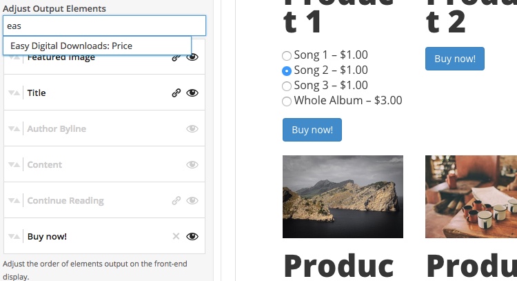
Build custom Easy Digital Downloads pages with Conductor

We’re excited to announce the general release of our Easy Digital Downloads add-on for Conductor.

This add-on enables users to create comprehensive landing pages, storefronts and marketing pages for their Easy Digital Downloads products. Easy create custom layouts to showcase your products without having to write a line of code. Visualize your page build out in the WordPress customizer and save changes as you make them.

Continue Reading

Blog, Conductor, Customizer, Note

Note 1.2 Release Special Offer

Note version 1.2 is now available on WordPress.org. Get it now.

There are some great features that are introduced in this version which make the core plugin and our Conductor plugin even better. To celebrate the 1.2 release, we’re offering a 20% off discount when you upgrade to Conductor Business and above. You can use the code: ELCAPITAN20 to save 20% off your order.

Let’s explore what you can do with with Note 1.2!

Continue Reading

Blog

How To Help Your Clients Understand Calls-To-Action

Using calls-to-action effectively helps increase email signups, social media participation and time spent on site.

Many of your clients may not fully understand calls-to-action and how design and placement matter. If visitors can’t find the links, buttons or forms, the CTAs are useless.

Help your clients by educating on the most effective placement and design strategies. They’ll appreciate your input and the conversion boost it provides.

Continue Reading

Rearrange Content On Homepage
Blog

5 Ways Publications Can Rearrange Content On Their Homepages

Publications aren’t restricted to a specific layout with all content elements remaining static.

These sites have numerous options to rearrange content on their homepages to find what works best for their visitors. Plus, simple changes make the site look fresh.

The following five techniques are simple, but can improve overall time on the site, social sharing and general appearance. You can even train your clients to handle some of these changes on their own.

Continue Reading

Better Website Headers
Blog

How To Improve Website Headers

The first thing site visitors see is the website header which helps them decide whether the site is right for them or not.

Designing the perfect header for your clients’ sites means engaging visitors, explaining the brand and adding aesthetic value all in one image. The right image can say more than an entire home page.

By working with your clients, you can improve their existing website headers to create one that helps draw visitors deeper into the site.

Continue Reading